Friday, February 2, 2018

A New Beginning


 Hello Everyone! My blog has been sitting for such a long time and I feel it is time to change that up and use it to share my new Business venture, Buttons Bows & Bling Dolls, so you can have a peek at the creative process behind how and why I make my dolls and all the other creative, pretty things I make.

During the last coup of years my creative flow moved away from home decor, furniture rehab and clothing and evolved to making and testing designer purse patterns and then finally landed on my very first love, doll making.  I now make custom one of a kind dress up cloth dolls, softie animals and clothing, with hand painted faces and wool felt hair. Many of the dolls and animals have wardrobes or the option to purchase extra clothing for hours of creative play and display for the designer dolls.

Due to continuing health challenges I decided not to take custom doll requests and only sell the dolls I have on hand. I generally work on series of designer dolls and then there are dolls just for hours of creative play. This blog will mainly let you in on my  thought process, tips, tricks and lots of teasers, but I will not be doing any tutorials or teaching here, just lots of pretty pictures and dolly fun!


I look forward to hearing what you think once I get it up and running again. Thanks for letting me share my new venture with you! Watch for those photos once I figure out how to do that from my iPad mini... lol!!!  See you soon! Laurette

Sunday, May 17, 2015

I Am Back

Hello dear readers!
I bet you are surprised to see a new post from me today... Lol! I know I have been gone a long time, partly due to health issues and partly because I have been so busy sewing and creating all kinds of new projects. My creative focus took me on new journeys and in different directions then I expected which is why you have not heard from me in so long. Anyway... I digress.. So here I am with lots and lots of new projects to share with you and all the other creative happenings in my life.

During the past year I went back to my roots and started sewing again with a focus on purses, accessories and a variety of other sewing projects. I also began testing purse patterns for a fantastic designer, Alicia Wietholter at Swoon patterns. In addition I started a closed group for Runaround Bags and accessories which I admin for and I joined a number of other sewing groups along the way. It has been a busy and exciting time with some great successes and a few failures but I am truly living my dream. Having said that... I hope to start sharing all those projects with you in the next few days;   that is if I can figure out how to access my photos from my IPad instead of my laptop.. Lol!, so keep an eye out for those.

Thanks for letting me share some of the updates going on around here, watch for those projects. See you soon!

Laurette


Saturday, July 26, 2014

Been Away

Hello Everyone,  I have been away from my blog for a long while due to the fact I have been working on lots and lots of new projects in my inside studio and my painting studio.  We have also been working on the outside of the house all spring and into the summer and we are finally done, at least for this year anyway! (Giggles!) I thought I better check in with you and let you know I have not fallen out of the blogger world for good I just got really busy. I have so much to share with you and I plan to be back doing that this week if at all possible.  Here is a small preview of my French Inspired Guest Bedroom.


These are a few photos from the French inspired guest bedroom makeover I completed after the guest bathroom refresh I did in the Spring. I made pillows, covered canvas with fabrics and created several crafty projects to give it the look I wanted. I just realized I have not downloaded a single project we did after we got this one finished. Yikes!I guess I have several hours of downloading work to do, oh well such is the life of a creative person.


These are a few of the accessories I originally added on the opposite side of the room; to be honest most of that has evolved over the last couple of months and I need to add new photos since I think the room might be done, NOT! Nothing is ever done around here as you all know.

Thanks for letting me share my news and one of my many projects.  I plan to be back as soon as I get everything loaded into my laptop. See you very soon.

Laurette

Wednesday, February 19, 2014

Bedroom Inspiration

I am at it again working on the styling of another room, this time our guest room is getting a makeover to coordinate with the guest bath.  If you follow me you know our guest bath was recently given a little facelift, going from bright colors to black and white with pops of blue on a tan/sand background. The guest bedroom color scheme is going from blues and greens to black, white and tan with an icy blue background to make everything pop; a very sharp, clean look.  Here are some of the photos which originally inspired both the guest bath and bedroom. Can you guess which elements in each room I was drawn to?


As you can see in the photos each room is crisp, sharp and coordinates very well together with some of the elements in each photo already in my design closet. But after evaluating the room and some of the furniture and other accessories in my stash I was not happy with the somewhat stark feeling of the room. True it did mirror the guest bath and my studio but I was not sure our guests would appreciate the lack of warmth and comfort.

Lately I have been very drawn to Shabby Chic, French and European design, which is not my usual style but never the less very appealing in its old world warmth and architectural design.  I was itching to give it a try, why not in a room which pretty much sits alone at one end of the house on the top floor? The funny thing is I made several Paris inspired pillows, from some fabric a reader sent to me last year, which were just sitting in my design stash waiting for a home. Even with all the photos, research and design boards done the pillow became my jumping off point instead.  It just goes to show, you never know which way a project is going to go, sometimes you just have to let it evolve naturally and see where it winds up.

Thanks for letting me share the beginning stages of my newest styling project with you.  I have a long way to go to get the room where I want it; follow along with me as I progress with lots of money saving DIY projects designed to enhance that Shabby/French/Paris feeling. This project is not going to be a quick one because I believe it will be evolving for quite a while so check in often to see what I am up to.
See you soon.
Laurette


Monday, January 27, 2014

Guest Bath Bling Reveal!

If you have been faithfully following my guest bath facelift you know I wanted to do a little something with that room featuring some of the accessories leftover from my studio re-org/makeover.  At this point in time I do not have time to paint the room or add new fixtures but we do plan to attempt that process later this spring or in the fall.  If you have not been following along and you are a first time reader, check out all the archives for January 2014 to catch up on the inspiration, process and DIY projects used for this finished project.  Are you ready for the reveal......OK, here we go, no words just photos.


Wow!!! What do you think, pretty glamorous, right?!?  I am totally in love with this very elegant, lady-like room and enjoy doing my make-up and hair in my new bling bathroom.  I pretty much took over the room all for me, no men allowed, unless we are having guests, giggles!

**            **           **         **          **          **         **          **         **

I just had a thought...ah oh!!!...........
The new guest bling bath and my studio makeover got me to thinking about our guest room and how it is no longer working for us since I removed my office from it. There is a huge space where the desk and printer sat and all the furniture which tied everything together is gone leaving kind of a gap in my original design.  I created that room makeover several years ago when I needed to have a place to write my blog and handle a few business details with the guest room designed around that purpose.  Now that I have a full office in another space I am pretty unhappy with the look, feel and purpose of the current floor plan and decor.  Guess what…it is time to give the room new purpose and a new makeover!!!!  Woohoo…more design opportunities with no painting necessary since I am very happy with the current wall color!  I am really excited to get started looking for fun inspiration and purpose, follow along and see where I go from here. 

Thanks for letting me share my guest bath bling reveal with you, I hope it inspires you to create a little facelift in your guest or master bath, give it a try, anyone can do it!  Oh by the way… the outdoor projects are coming along but will not be completed for another week or so but I will share those as soon as I can.
See you soon.


Laurette

Saturday, January 25, 2014

French "Rustic Toile" Valance

As you know I have been working on a little “facelift” for our guest bath; creating all kinds of projects to give it some elegant glamour and I finally just finished the last of my projects.  Woohoo!!!  My final project was to make a new valance to go over the bathroom window, something to tie everything all together.  I searched through all of my resources and did not find any inspirational ideas for valance style; however, they did help me to decide on the fabric type, color and pattern I wanted to use.  I chose (from my fabric stash) a nice home decor heavy weight fabric in a black and white toile print. Take a look.

This is the plain window with 2” wooden blinds already up and a basic white shower curtain, nothing special to look at here.

This is the fabric I had several pieces of in my stash, wonderful remnants I got at the fabric store for a steal, super pricey otherwise. The fabric is “Rustic Toile” by Waverly Fabrics from the home décor line, about 1 yard long. When I am working with an expensive piece of fabric which is going into a room where it may not stay for a long time I try to sew it up in a way which allows me to re-use it later.  Instead of cutting the fabric I used the whole piece by pressing the selvages under on the sides then folding it in half to create a self lining and turning down the top edges to make the rod casing and using the largest stitch allowance my machine would sew.  The long stitches are easy to take out if I ever want to turn the valance into whole fabric again.

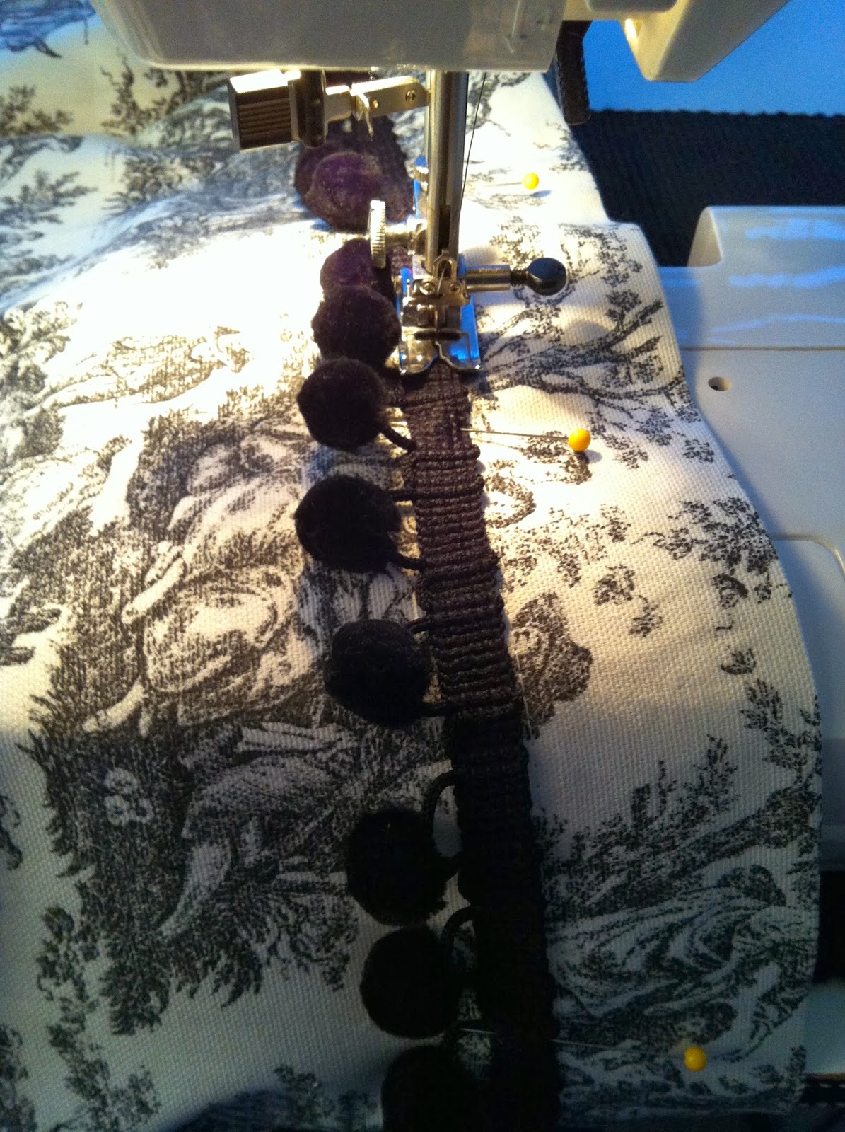
Once I had the casing finished I hug the valance giving it a bit of pouf but I felt it was missing something.  I went to my notions stash and looked for something to give it a pop of black because the light print faded into the very white shower curtain right next to it creating a lack of contrast.  I found some really pretty French jet black pom-pom trim which seemed to pull out the black and give it more definition.  I simply used the same stitch length to sew it just below the casing stitching, easy to remove later down the line if I wanted to re-use either of the items.

Here we are all done and already hanging up right over the window.  I just love me some toile, I would put it everywhere if I could get away with it! I cannot show you how well it adds contrast with the shower curtain right now… you have to wait to see the whole thing in the reveal in my next post. Hehe!!!

Thanks for letting me share my final bling project for the guest bath facelift; I am very pleased with the results so far, I cannot wait to see what you all think.
See you soon.


Laurette

Thursday, January 23, 2014

Glam It Up!


I had a few accessories leftover from my studio makeover which did not have a home so I decided to use them as the jumping off point for the re-style of our upstairs guest bath.  After playing with the layout of the accessories I realized I needed a few more things to tie everything together.  I wanted to use several things I already had on hand before going out and buying anything new, all I had to do was glam them up with a bit of bling! Here are a few simple projects I did to achieve the look I wanted.

I have a lot of black, white and crystal embellishments in my paper crafting stash so I thought why not use some of those to add that bit of black and sparkle to a few items I could use in the bathroom.

My first project was to bring a little pizazz to a basic soft blue candle.  I used some stick on crystals and black & silver adhesive stickers and stuck them on the side of the candle, so cute!

For this project I wanted to glam up some basic bath salts so I tied some narrow black satin ribbon around the neck of the bottle and added a small black crystal adhesive sticker to the center of the bow.  It was still a little blah so I used another one of the stickers from the same pack as the candle and placed it in the center of the jar; much more elegant now.

I had two glass jars already on the counter but they were just not up to the same glammie standards as the rest of the accessories, too much silver and no bling.  I wanted them to match a pretty glass candle holder from the studio I wanted to re-purpose as a holder for pretty soaps.  I grabbed some black ribbon and some bling buttons to match the candle holder and went to work.  Aren’t they gorgeous, I just love their elegant bows and pretty sparkle in the light!

For my final project, I took a fabulous card my daughter had given me and put it in a basic black frame.  The card had all the elements of the room in it and would tie everything together when placed on a small décor shelf on the wall.  So easy and very effective!

Thanks for letting me share my glammed up projects with you, I hope it inspires you to add a bit of easy sparkle to your life; every girl needs a bit of bling!  More to come about the guest bath bling facelift keep checking in often to see what project is next before the reveal.
See you soon.

Laurette


Tuesday, January 21, 2014

Guest Bath Bling

I have a couple of fun posts coming up starting with this one.  As you may have already guessed I have a thing for decorating with black, white & bling, usually all together in one room but sometimes the bling shows up with other colors too, I love my bling. My entire studio is decorated in that combo and my future walk-in-closet will also be in similar décor colors so I thought to myself why not do the same things in the guest bath right next to the studio?  I had been looking for inspiration but just could not settle on anything until I found myself with quite a few leftover accessories from my studio makeover; the guest bath was the perfect place for them. All those black, white and bling accessories would be my jumping off point for that room.


I just wanted a quick little project to do while waiting for my hubby who was getting started on a much bigger project outside which I would not be doing very much work on, with the exception of the design decisions as he went along. Anyway…. back to my project, I will share that other project soon.  I knew I was not going to paint or change out any fixtures at this time, maybe later this spring, oops!.... don’t tell my hubby that! I was only going to have three or four days to do a little styling/makeover/face lift. Now that I had a jumping off point I needed a design direction so I pulled out some of my resource books, magazines and Pinterest boards.  I have close to a hundred resource materials which can make putting together design/inspiration boards a pretty lengthy but fun process. Here is some of what I chose for my design inspiration and why.

What drew me to this picture are the black and white shower curtains, the crystal chandelier, the bold yellow accents and the green plant in the tub.

This photo was close to the wall color currently in the bath with white trim work, and black and white art prints. The accessories I wanted to use would work well with all the hard surfaces already in place.


These next three photos were ultimately where I wanted the walls and accessories to go once they were painted and decorated sometime in the near future.

I was totally attracted to the wallpaper in this shot and the beautiful mirror and white woodwork.  I would not be doing wallpaper but I needed some inspiration for the valance for the bathroom window next to our tub/shower.

Even though I loved the yellow accents in the first photo my favorite colors are in the blue family so this photo shows them all tied together and just what I was going to be using for my pops of color.

Now I was ready to create my design boards, you are probably wondering why I use them, the truth is I not only use them to inspire me but I also use them to remind me of all the little details I want to incorporate into the project; my memory is not what it use to be these days and this way I would not forget and get off track.  Whenever I see something visual that speaks to me in an advertisement, magazine or book I cut it out or make a copy and put it in a box or in one of my inspiration binders so I can use it later when I finally get to the project I want to create, then onto a board it goes.  These boards have a little of everything on them including physical elements I want to incorporate into the project.

Once my boards were completed I pulled fabrics from my fabric wall and trims, ribbons and bits of bling from my stash and I got down to some real design work; I was off and running.  You will have to read future blog posts to see what comes next.

**The reason I shared all of this is because many times I am asked about my creative process and how I decide what goes into a room. So here it is and something you will see on my blog from now on as I go along creating new projects all year long.

Thanks for letting me share my creative process with you; I hope you will check in often to see what décor projects I created to go in my new bling guest bath and of course to see the before and after photos and the final reveal.  Oh...I almost forgot!!! There are also the big outdoors projects which we are currently working on, lots to see, stay tuned!
See you soon.

Laurette


Thursday, January 9, 2014

Organization & Reveal

I was not sure if I wanted to show you the studio in progress or just the reveal but after thinking about it I decided to show you a little bit of my process.  I am very visual so I usually start with pictures from a large variety of sources then I think about it for a little while, then do a ton of measurements and finally I start to move things around to see if what is in my head is really going to work or if I have totally lost my mind.  Good thing for me what I saw in my head was going to work well because some of the furniture and organizing units were awkward to move by myself and also kind of heavy.  First up was packing up all the “stuff” on my sewing/craft counter; there was more there then I thought taking longer then I hoped. From there I moved over to the window wall to remove things from the top of the cube storage units.  The only thing I could not move by myself was the flat screen TV and all the electronics; I had to wait for my husband so we could move everything in unison.  In the meantime while waiting for him I wrestled down the 8 feet of counter top nearly giving myself a hernia, that was a dumb idea, I had no idea how heavy and awkward that was going to be, Yikes!!!  OK, time for the photos of the rest of my progress, don’t laugh too hard, this was hard work and would have been ridiculous to watch if I had video taped it.
 
Oh by the way…. Please excuse the poor quality of my photos, some were taken at night and others with the bright sun streaming in from three big windows, also I seem to be getting shaky hand syndrome and I need a new camera so these are not the best.  Here they are anyway…..you get the idea.


The great migration of the three cabinets and some plastic storage units from under the counter being shimmied/rocked, still full of supplies, across the room to the window wall…Ugh!

First set of cubes empty and moved to the old counter wall waiting for the TV and electronics to be moved back on top of it. The cabinets are set in place waiting for a very heavy counter top to be put in place.


Here we go…electronics in place, cubes in place, cabinets and counter top in place ready to be loaded up. I set some decorative pieces on top of the counters to get a feel for the space.  Almost looks like I am done until you turn your head and look down the room and see this….


Yikes!!! What a mess and the second half of the counter top is missing and there is stuff everywhere!  From here on out it was a huge project to drag the tall storage cubes out of the closet and put them into place so I could add the second 6 foot counter on top of them.  Tons and tons of organization and purging went on in the closet and with all the supplies and décor piled up on the cutting table and on the floors and in the other rooms…Wow!!! It took four intensive days to get it all sorted out and put into place.  Talk about being sore and tired but it was well worth it.


The hubby and I worked in separate rooms building the two new storage pieces for my sewing counter.  I bought several more but found I did not need them and I did not want to clutter up my space with too much stuff, only what I really needed, back to Michael’s they go.


Here they are; my two new storage units; aren’t they grand!!! I am totally in love with them both, perfect for my sewing notions, book and patterns. Everything is nice and neat and easy to see and use! 

And last but not least….. Ta da…. everything in place!!! Take a look.


These are the nighttime photos I shot when I finished, starting from left to right. Did I mention I now have fourteen feet of creative space to sew and craft in!?!


Wow, look at all that daylight coming in those three big windows!!!  The room looks so much larger and less cluttered, I am one happy camper and I got exactly the room I set out to create.  What more could a creative gal ask for!?!

Well… there you have it, the new configuration and organization of my creative studio.  I hope you enjoyed taking a peak into my new work space; I can not wait to get in there and do a little detail clean up and sew up some curtains to cover up the storage cubes and all the storage under my work counters.  When I get those done I will share the before and after photos of the whole studio side by side so you can see the transformation all in one place.  Time to finally take down all my Christmas décor and get it to storage then take a little rest before tackling the next project; we have so many I have no idea what is next, I guess you will have to check in to see what we are up to.
See you soon.

Laurette


Related Posts Plugin for WordPress, Blogger...